The evolution of lettershapes, children’s handwriting, and type

by Noel Pretorius and María Ramos

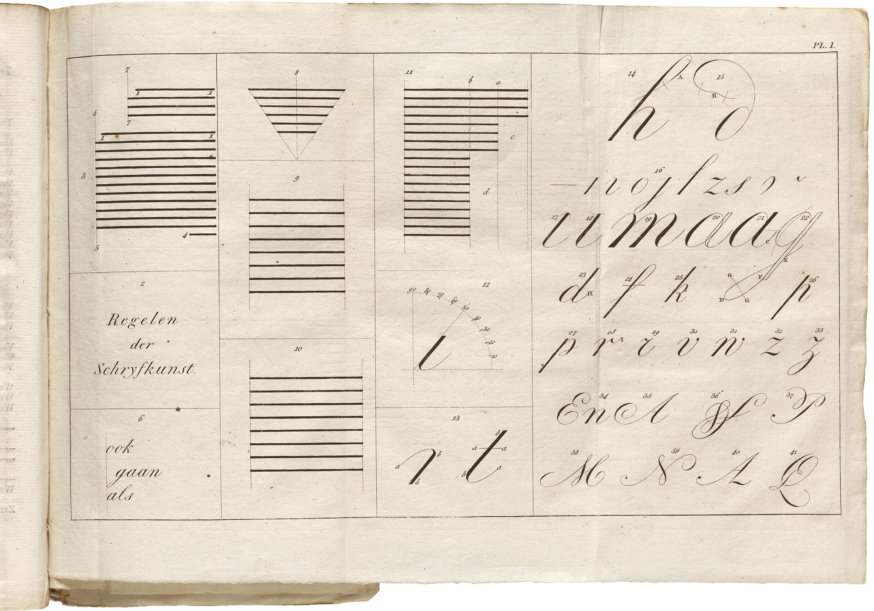
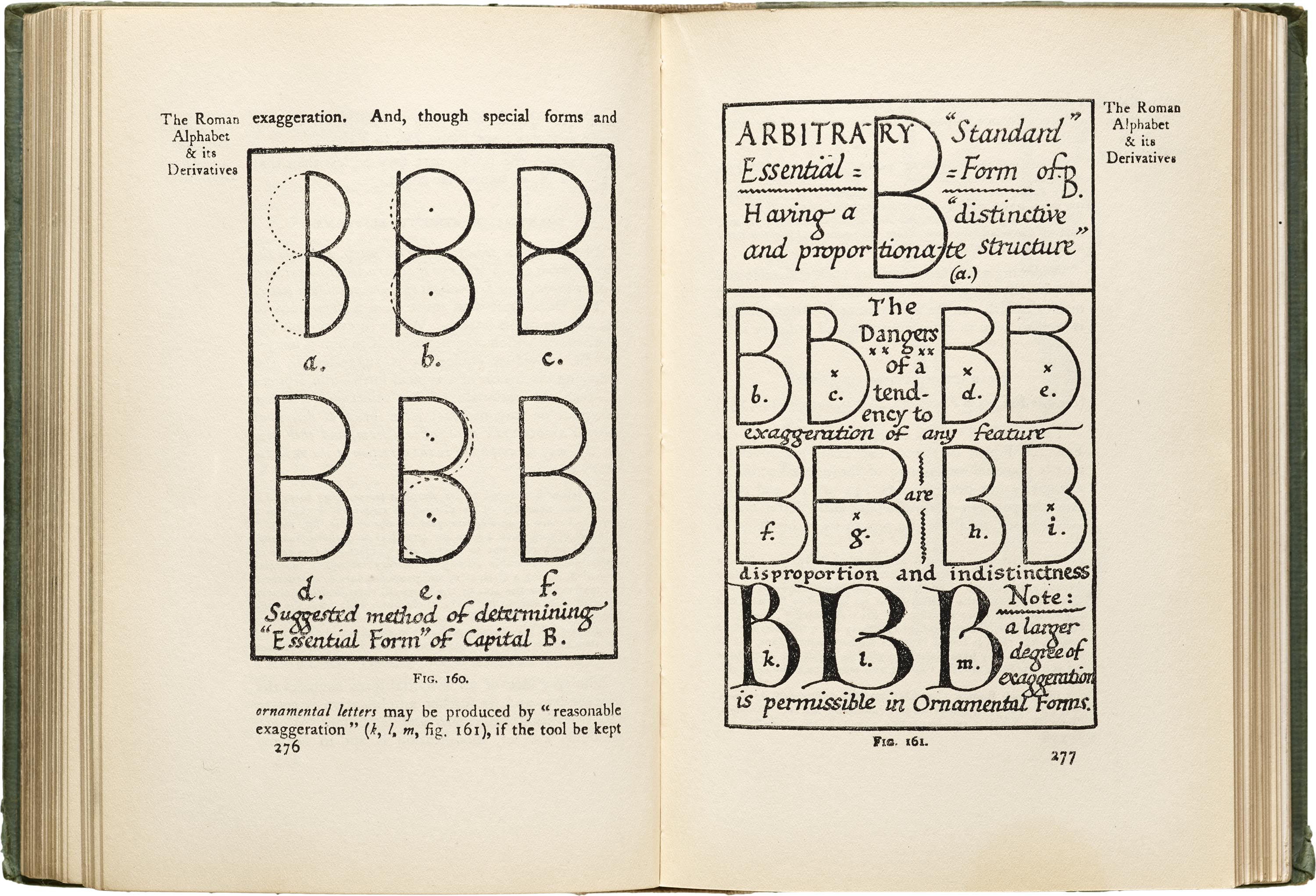
We all have our own story and relationship to handwriting. The origin and evolution of typography lie in handwritten forms. Studying the practice of handwriting helps to understand the structure and rationale behind each letter and gives inspiration to new typographical forms.

Around the time when NM type was starting up, Noel, one of its founders, became a father. Our new project is inspired by the handwriting of Noel’s four-year-old son, Sixten, and seeing the forms of the alphabet from a fresh perspective. NM type’s new typeface is a display font that references the unbridled creativity of a child, not burdened by the rules of handwriting yet.

This essay offers information on the connection between handwriting and type, the influence of children’s education and the history of writing.

Evolution of lettershapes

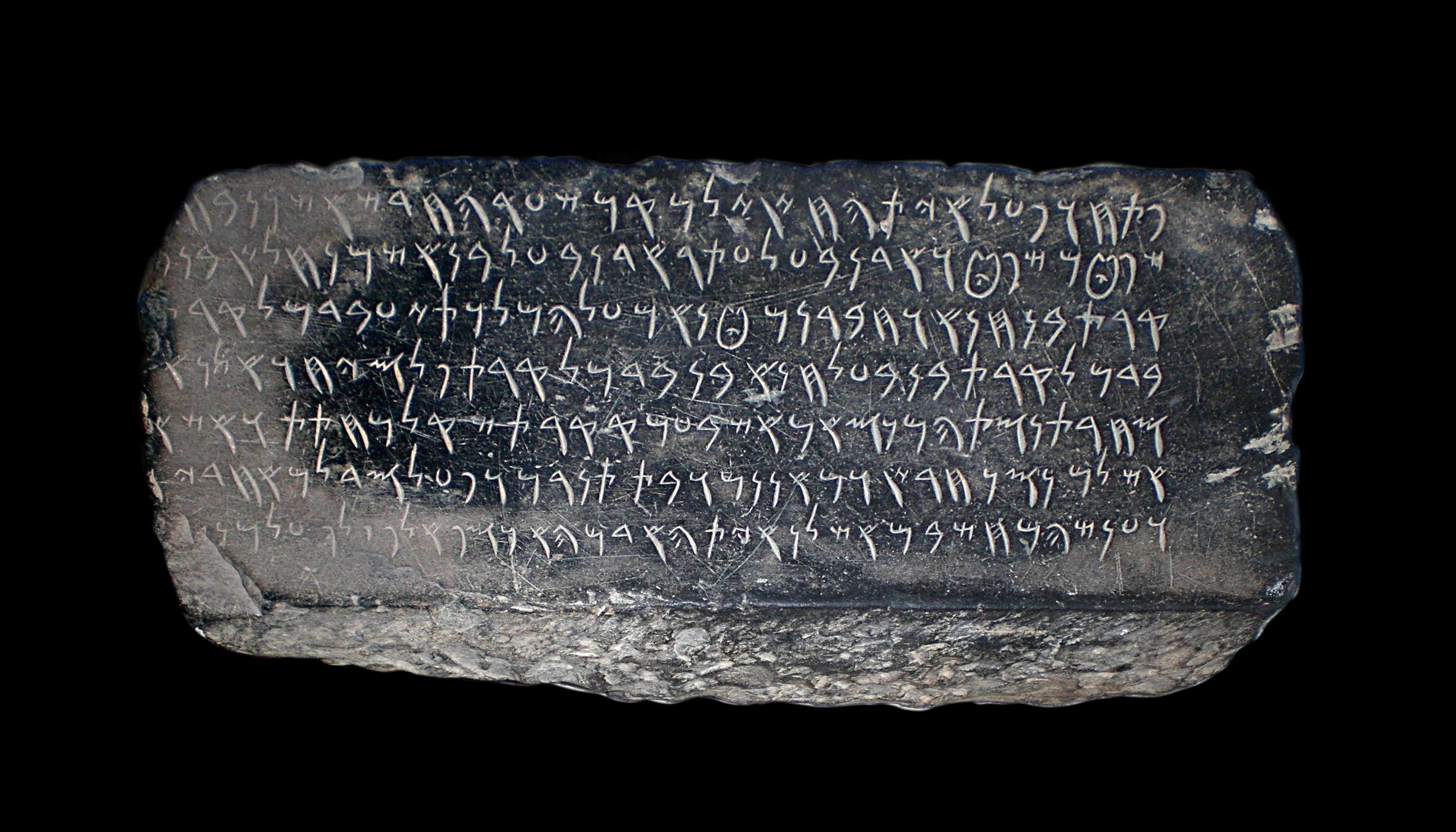
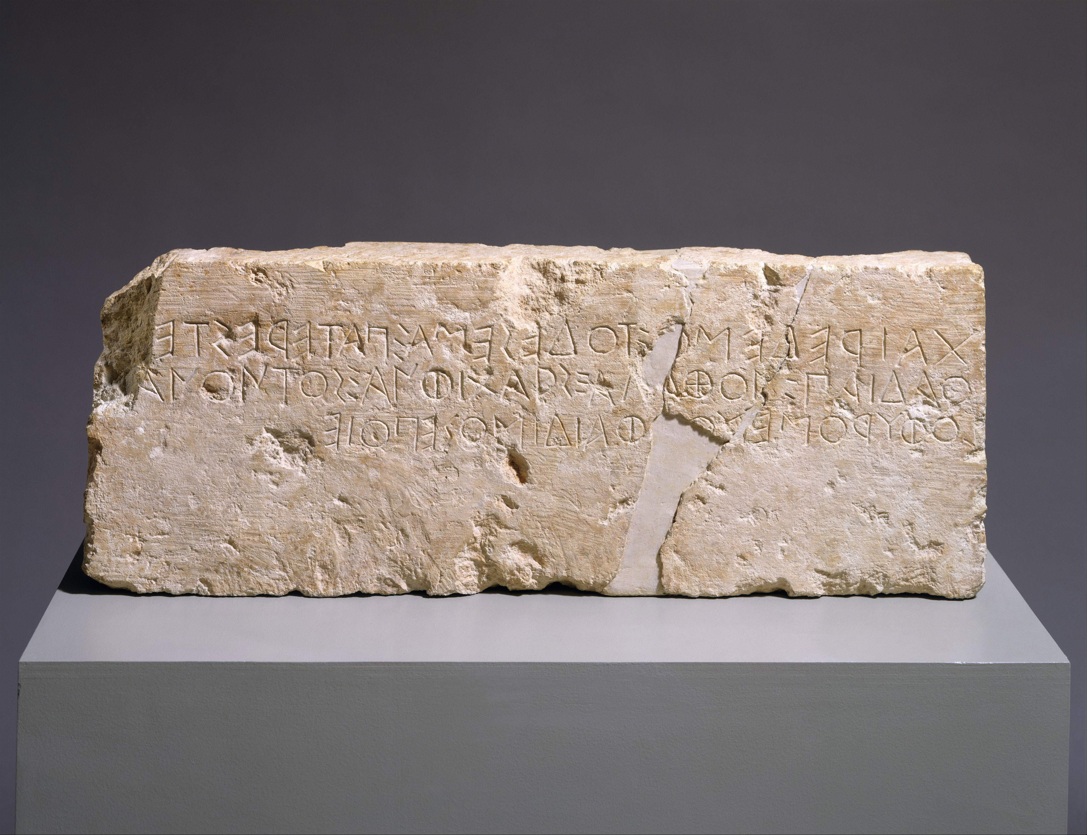
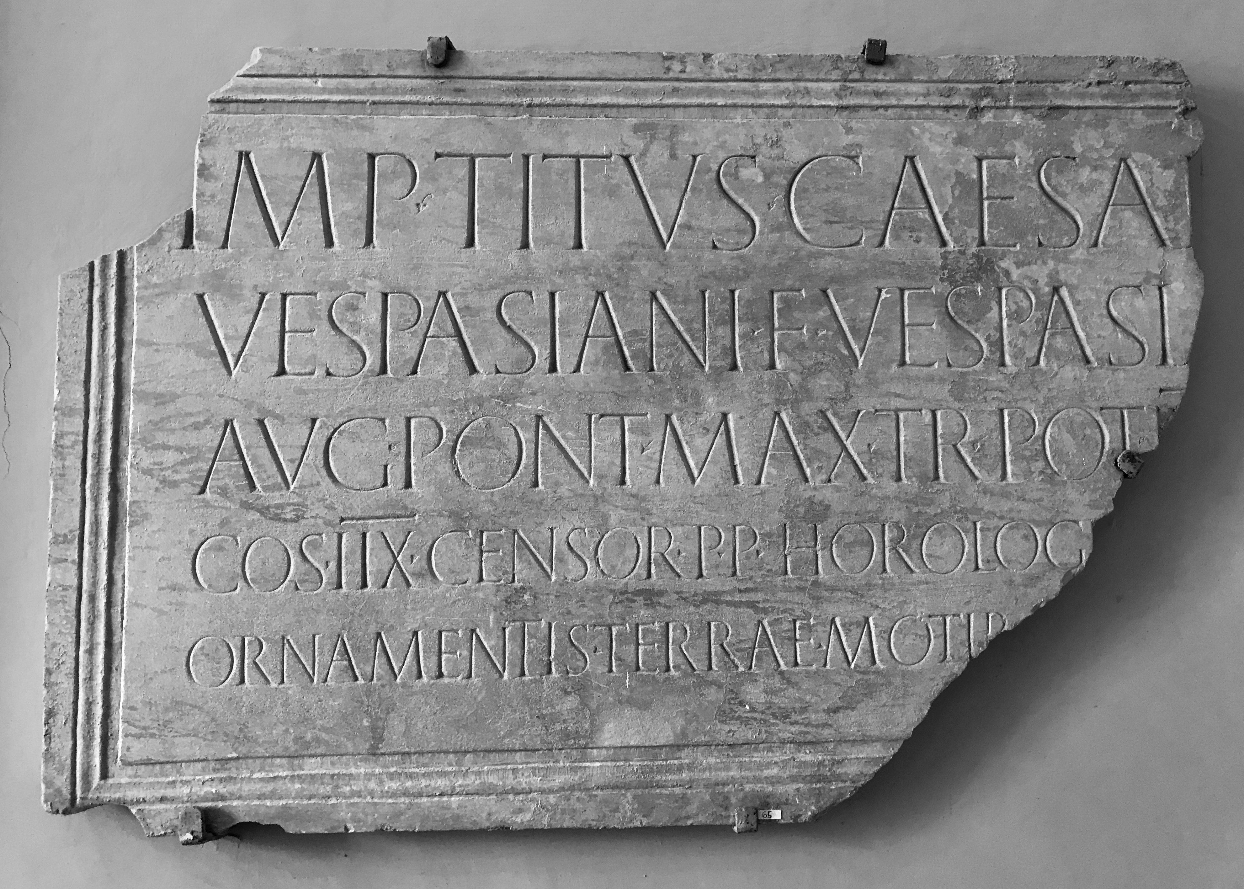
The Phoenicians, in 100 BCE, planted the seed for many alphabets today. In their writing system one sign represented one sound. The complete alphabet contained only 22 characters, which were all consonants. Shapes were borrowed from previous hieroglyphic forms and letters were named with words that started with the sound they represented. The power of their alphabet meant that letters could be used in different languages and improve literacy. Their simple linear shapes became the source for the Greek and the Roman letterforms we still use today.

Fig. 1 Carthage Administration Inscription using the Phoenician alphabet (KAI 303, 4th to 2nd century BCE)

 Photo: Habib M'henni

The early Greek alphabet relied on simple shapes; geometry was essential. The Greeks and later the Romans could write text as boustrophedon, ‘turning as an ox in ploughing’. It is a style where the writing direction is switched from left to right and right to left in alternate lines. Many letters, like B or K, could be written in a mirror style, depending on the direction of the text.

Fig. 2 Front of a limestone block from the stepped base of a funerary monument. Phaidimos, mid-6th century BCE

The Greeks’ modular and geometric approach to letterforms was also visible in the Roman alphabet. Over time, the shapes became more sophisticated. The Romans trusted human perception to achieve more balanced proportions for letterforms. Around 50 BCE, we see changes in stroke thickness that add a new layer to basic skeleton shapes. The tool used for writing set a new paradigm, combining thin and thick strokes. The style very much depended on the angle of the tool. A flat position, at an almost vertical axis, created the formal style, used in Roman inscriptions. If the pen was held at an angle scribes could write faster, a method considered appropriate for books. Many different styles of calligraphy developed from there. The invention of the printing press around 1440 promoted the use of Blackletter, which became the predominant style for books at the time.

Fig. 3 A fragment of an inscription about an order by the emperor Vespasian to repair a clock which had been destroyed in the earthquake of 79 A.D. at Correale Museum

 Photo: Greger Ravik

During the Renaissance, the Florentine scribe Poggio Bracciolini reinvented classical lowercase and capital letters, moving towards what we mostly read today. Bracciolini moved away from the condensed gothic script in favour of more simple distilled forms. His shapes would become an inspirational source for the roman printing types created by Nicolas Jenson in the 15th century.

Fig. 4 A text sample from Nicolas Jenson’s Justinus, ‘Epitomae in Trogi Pompeii historias’, Venice (1470)

The shapes of letters have been passed from generation to generation. The alphabet children learn today is not that different from the alphabet in previous civilizations. We start to read and write, identifying letters that include numerous variants of basic skeletal shapes.

Children learning to write

The form and priorities of handwriting have altered with changes in education, the economy, politics, technology, and tools. With different writing models, there was a historical journey towards speed and efficiency. Only by the end of the 20th century did children’s education consider freeing their creativity and avoid old rigid skill training. New learning models would be less time-consuming and empower inventiveness at a young age. A well-know researcher on the topic, Rosemary Sasson, talks about using ‘informed flexibility’ instead of ‘didactic rules’, ‘allowing children, like adults, to have different tastes and innate abilities’.

Children can be taught to write any letter. They first learn to control their hand to follow their eye. Once they have learned the form by heart, only the most creative or rebellious break the mould of predefined writing models to find a unique style. To find those distinctive shapes, they need to explore them before the rules limit their imagination.

If we travel back in history, the writing style of the 18th century was copperplate. Children used pointed steel nibs. The tool gave them limited freedom since they needed to write in rigid movements. The hand holding the pen did not rest on the table as it does today. For longer words, pen lifts relieved strain on hand muscles, otherwise letters would become distorted. Learning to write became sort of an industrial training. Writing education broke down letters into elements, just like manufacturing was breaking the process into parts. Before children were able to write words, handwriting exercises included body training, like sitting in a proper way or learning to hold the pen.

Fig. 5 Manual to the Writing Arts (1830)

With the development of new tools, different writing models were introduced in schools, and print script and semi-cursive styles became popular.

The calligrapher Edward Johnston was an important figure in the development of children’s handwriting during this era. He looked for less complicated writing models to teach young children. In 1906, his book Writing & Illuminating & Lettering influenced handwriting worldwide.

Children were being set the hopeless task of copying with pens, on paper, letterforms made partially evolved by gravers on copper plates. (E. Johnston, in Sasson, p. 57)

Johnston suggested they should start with essential skeleton Block Capital letters. In 1913, at a London County Council conference, his proposal to adopt simplified block letters—print script—was approved. These simple forms, consisting of straight lines and circles or parts of circles, could be more easily learned than cursive forms. The frequent pen lifts removed strain on the hand and arm. Print script was similar to drawing since the strokes and letters did not need to join.

Fig. 6 Edward Johnston, Writing & Illuminating & Lettering, 14th Ed. London, 1925 (1st Ed., 1906)

There has been a number of lettering guide-templates that have researched the pre-writing stage of children. Friedrich Soennecken created a set of adjustable modular geometric elements, introduced in primary schools in 1913. Modular construction is also the idea behind Bruno Munari’s ABC con fantasia (1960), and, more recently, Éloïsa Pérez created Prélettres (2014).

Fig. 7 Friedrich Soennecken Schriftsystem (1913)

Some have predicted the end of handwriting to be completely replaced by typographic forms. No matter what happens in the future, our letters will always be rooted in previous handwritten forms. New tools and models have only impacted their evolution.

A new typeface inspired by the early letters of a child

While we were defining the features of our new typeface, we felt the need to research these two topics we’ve just explored. We did a historical regression to the evolution of the alphabet and took a closer look at children’s education. The departing point for our new typeface design was the handwritten letters of a four-year-old child named Sixten. This knowledge helped us look at our inspirational source from an informed position while keeping an open mind to how the shapes should look.

The project raises questions on writing rules, considering that they limit our natural instincts for creating lettershapes from a young age. As grown-ups, we take some things for granted. We replicate patterns and models taught by teachers at school, relatives at home or friends in a social environment. As professional type designers, we also mimic learnings from previous work, only daring to propose new models from time to time. In this project, we challenge our preconceptions of right and wrong when shaping the alphabet.

There are no absolute right and wrongs about handwriting, as long as it serves the needs of both the writer and the reader. (Sasoon, p. 159)

While researching, every time Sixten came home from nursery school, it was a glimpse into his world. His drawings contained lettershapes, sometimes written backwards. It turns out that mirror writing is a common practice at a young age. It is triggered by how the brain works. The left part of the brain is responsible for order in language, and the right remembers the word as a picture. When the right area recreates the image, it does not give importance to the shape orientation. The reason for this is our survival instincts. We can recognise a lion from any angle and act quickly to danger, the predator does not have to be facing us from a particular perspective. Children, at a young age, can’t tell mirror forms apart. There are no wrong shapes or wrong order, early letters are just things that can be seen from different angles.

Another interesting finding was the connection between some of Sixten’s early letters and those in the Phoenician and Early Greek alphabet. As he is learning, his shapes are more intuitive than the ones he will create as an adult with a complete understanding of writing rules.

All these observations were considered and preserved in the shapes of our new typeface design. Sixten is a crafted variable font with a large number of variants. The design space includes four extremes, Regular Narrow, Regular Wide, Black Narrow, and Black Wide. The Narrow width is full of character and more faithful to the original source, while the Wide is more conventional. This new concept for the type family changes design features from Narrow to Wide, affecting not only the width but also the skeleton of the letters.

Sixten (a Viking name that was first seen inscribed on old runic stones) is a display variable font. There is an elementary construction of the letters, which is especially visible in the ball-and-stick structure of lowercase characters. A range of 12 stylistic sets mixes the different alternates in the font, which include flying small caps, mirrored uppercase, flag caps and many more.

Baseline alignment and letter orientation is not prescriptive in the typeface. The lowercase letters and small caps (petite caps) share the exact same height so they can be mixed, and it is possible to experiment with the alternative shapes in dynamic text settings.

Sixten’s instinctive letters have been reduced to their simplest shapes, distilling ideas from a child’s early handwriting into typographic forms. There is a joyful and positive vibe to the typeface, it’s a little bit runic and a little bit punk. Sixten is a versatile typeface family for display use.

Bibliography