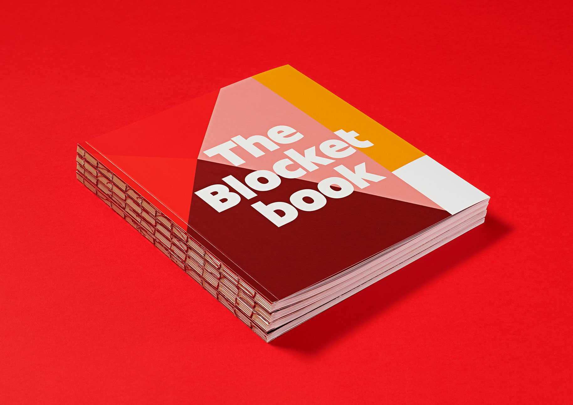
Founded in 1996, Blocket –notepad in Swedish– got the name to offer people a connection to something familiar in the new and unknown world of the internet. The company rapidly grew into a nationwide marketplace for everything needed in life. The original logotype was used as the departing point for the new display typeface. We studied the shapes of the letters and identified some features that were brought into the design of Blocket Display. The logotype was strong and powerful and we focussed on developing the character set from those letters, so the overall appearance could be easily recognised by the audience. We made some small adjustments to the logo but kept the shape of letter ‘o’ untouched. This form is inspired by the Superellipse table and much of the brand essence is based on it.
The new font is integrated into a larger typographic palette and needed to fit with their custom text fonts. The design formula includes spurless letters that sit on the baseline, with no overshoot. The shapes are compact, the terminals extend to the extremes of the form creating solid blocks. And characters with crossbars, like ‘t’ and ‘f’, use just one side of the stem, keeping the skeleton for the letters simple.
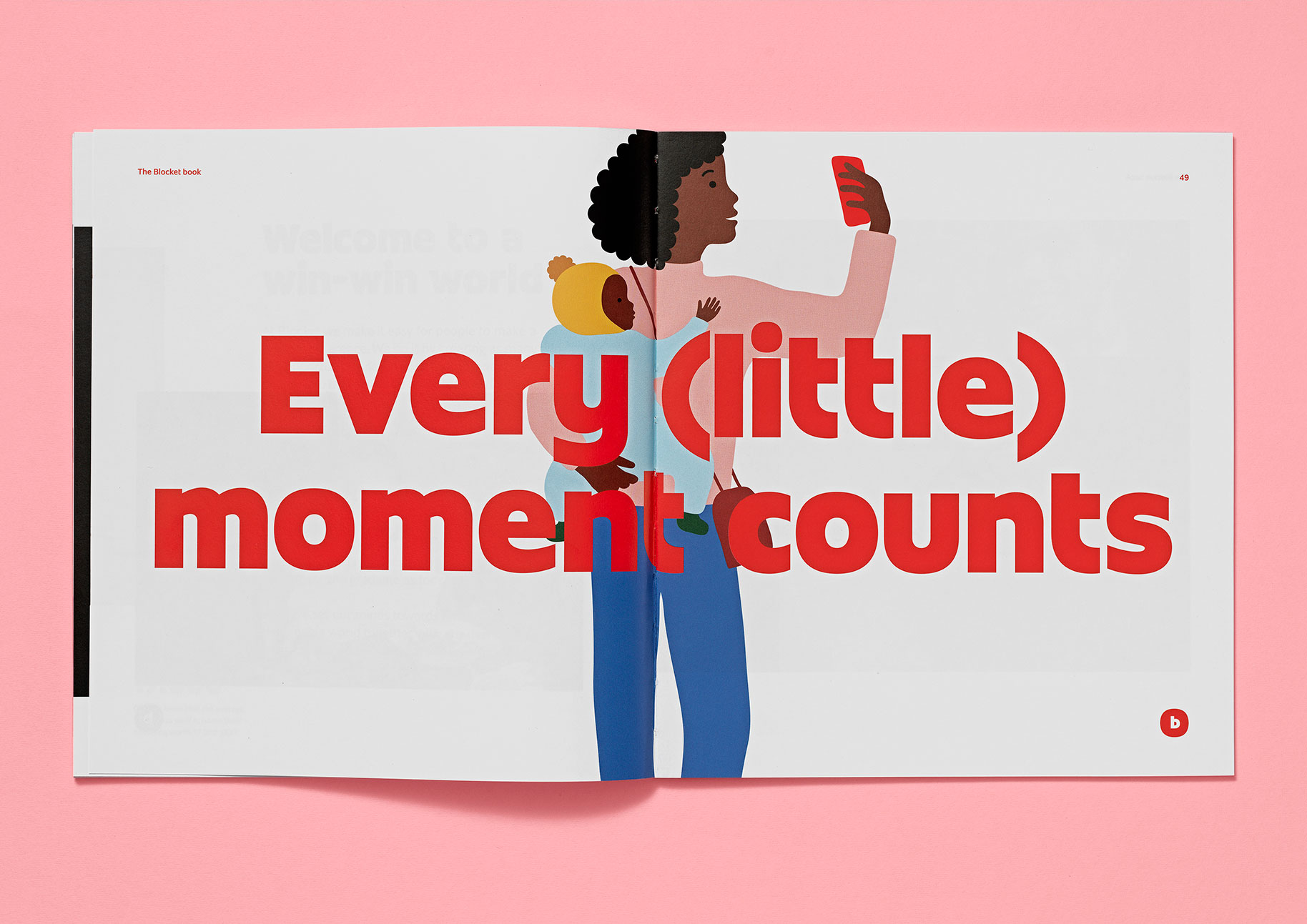
The typeface is heavy with short ascenders and descenders. It is used for headlines and short paragraphs that need to speak out but not loud. Blocket Display makes the brand easy to recognise, even when the logotype is not present.
- Client
- Blocket
- Design agency
- Identity Works
- Release
- 2021
- Type design
- Noel Pretorius & María Ramos

