Meister is the corporate typeface designed by NM type for Jägermeister’s global communication. The custom typeface gives the brand a unique voice in all media channels. The bold geometric shapes of the Bauhaus have served as an inspiration for the design, a reflection of Jägermeister’s German roots.
There are three key design features that make Meister typeface unique: the 45° angle cuts and diagonal strokes, the flattened curves, and the blocky appearance.
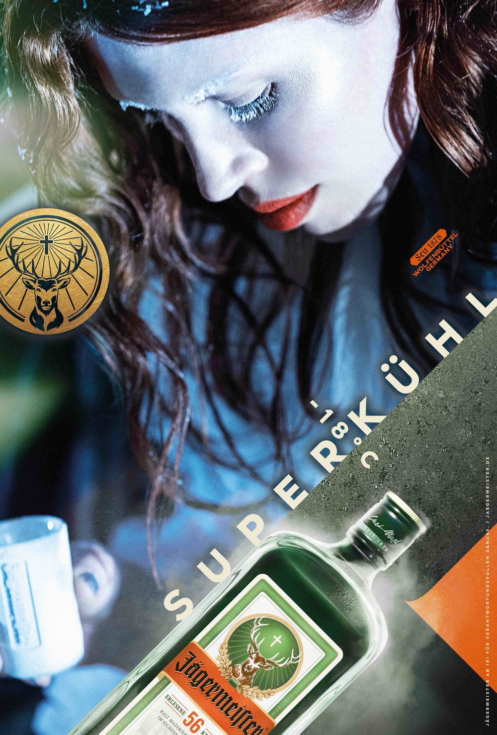
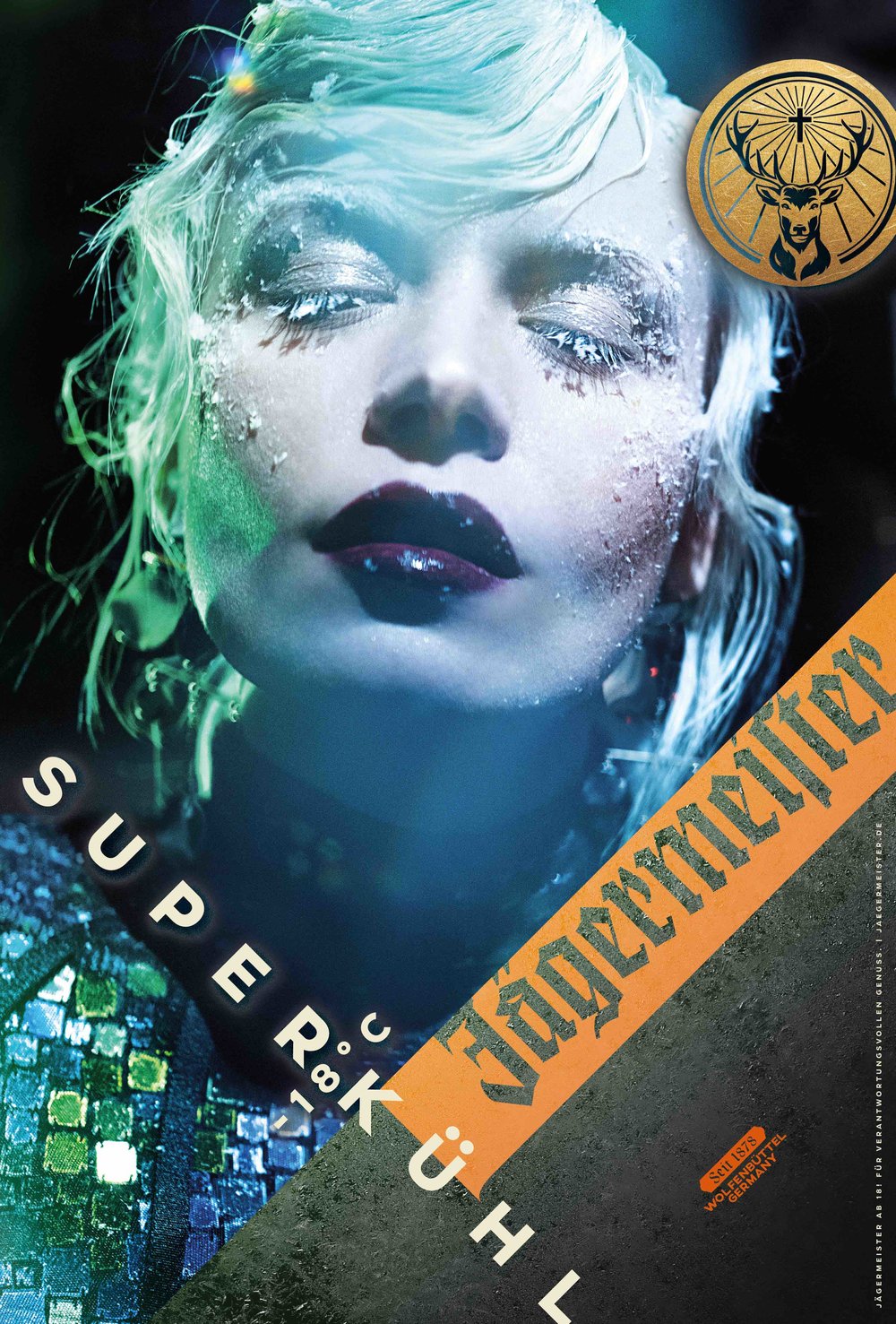
The typeface fits perfectly in the dynamic design of Jägermeister’s advertising campaigns, where the 45° typesetting is an important feature. Letters like K and R have 45° angle diagonals and the terminal ends of characters are cut at that same angle. This provides stability when the text is rotated. The flattened curves of the letterforms reference Jägermeister’s iconic bottle shape.
The proportions of the uppercase letters in the typeface are closer to a square than a rectangle, giving it a distinct blocky appearance. The character set includes diacritic alternates to help maintain a solid blocky shape in different languages.
The typeface also includes ‘twin’ ligatures, which melt two identical letters into a unique shape. These new letterforms give Jägermeister an exclusive and modern design expression.
The typeface was created for Jägermeister’s new global identity and advertising campaigns, marking the first major rebrand in its history.
Meister is a type family that covers most languages using the Latin, Cyrillic and Greek scripts. The fonts were developed in collaboration with experts in every alphabet, who helped in shaping the letters to fit in the multiscript custom font.
- Client
- Jägermeister
- Ad agency
- Opperman Weiss
- Multiscript design direction
- María Ramos & Noel Pretorius
- Latin design
- Noel Pretorius & María Ramos (2018)
- Cyrillic design
- Krista Radoeva (2021)
- Greek design
- Noel Pretorius & María Ramos (2021)
- Greek consultancy
- Gerry Leonidas