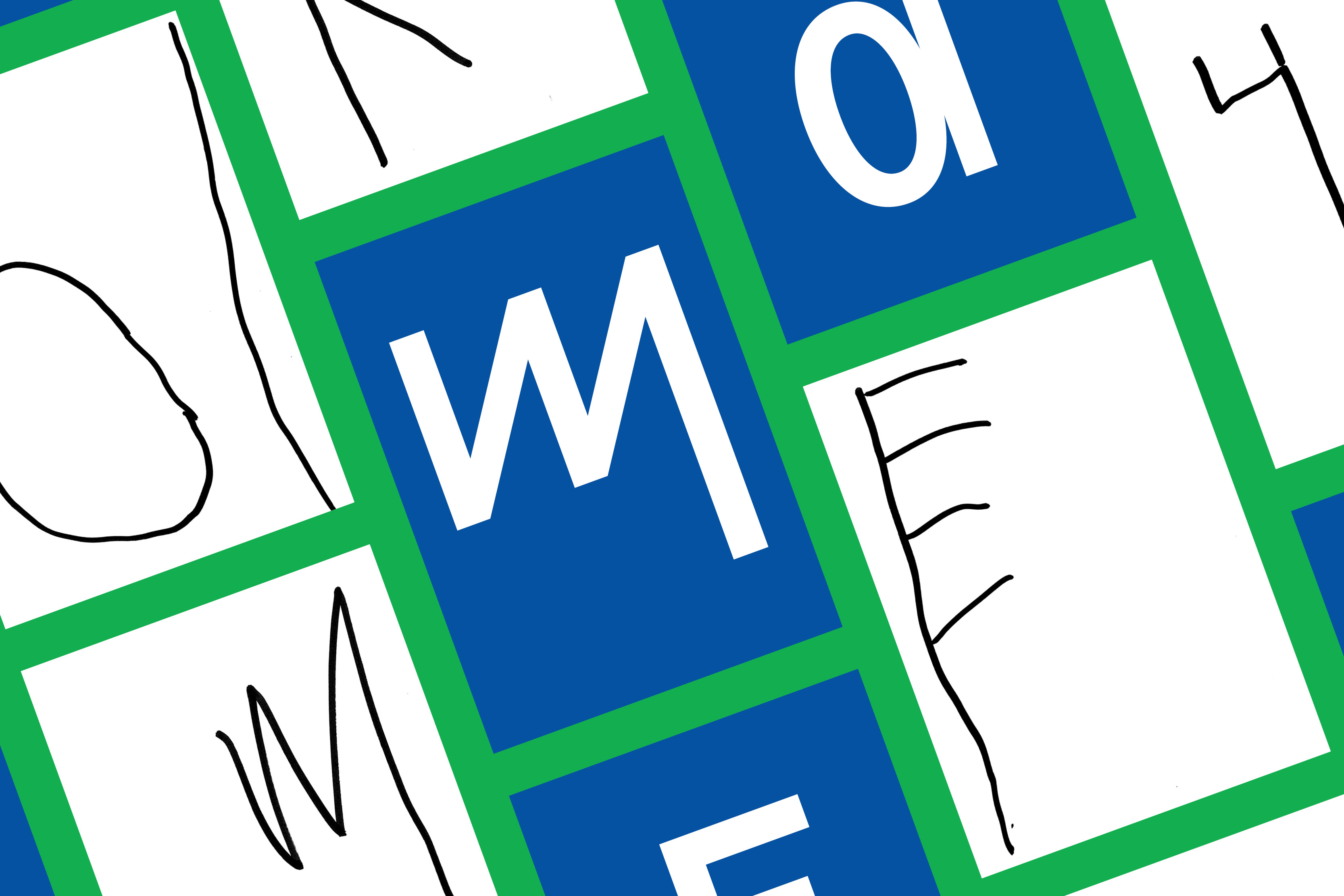
Sixten is a versatile typeface inspired by the unbridled creativity of a child. It’s a playful type family with more than 900 glyphs. Sixten, the son of one of NM type’s founders, has been the source of inspiration for the typeface, with his intuitive approach to drawing letter shapes as a four-year old. The design process unveiled some interesting findings, like the connection between some of his elementary letters and the Phoenician and Early Greek alphabet.
The project raises questions about writing rules, considering that they limit our natural instincts for creating letter shapes at a young age. As grown-ups, we take some things for granted. We replicate patterns and models taught to us. Professional type designers, also mimic learnings from previous work, only daring to propose new models from time to time. This project challenges our preconceptions of right and wrong when shaping the alphabet.
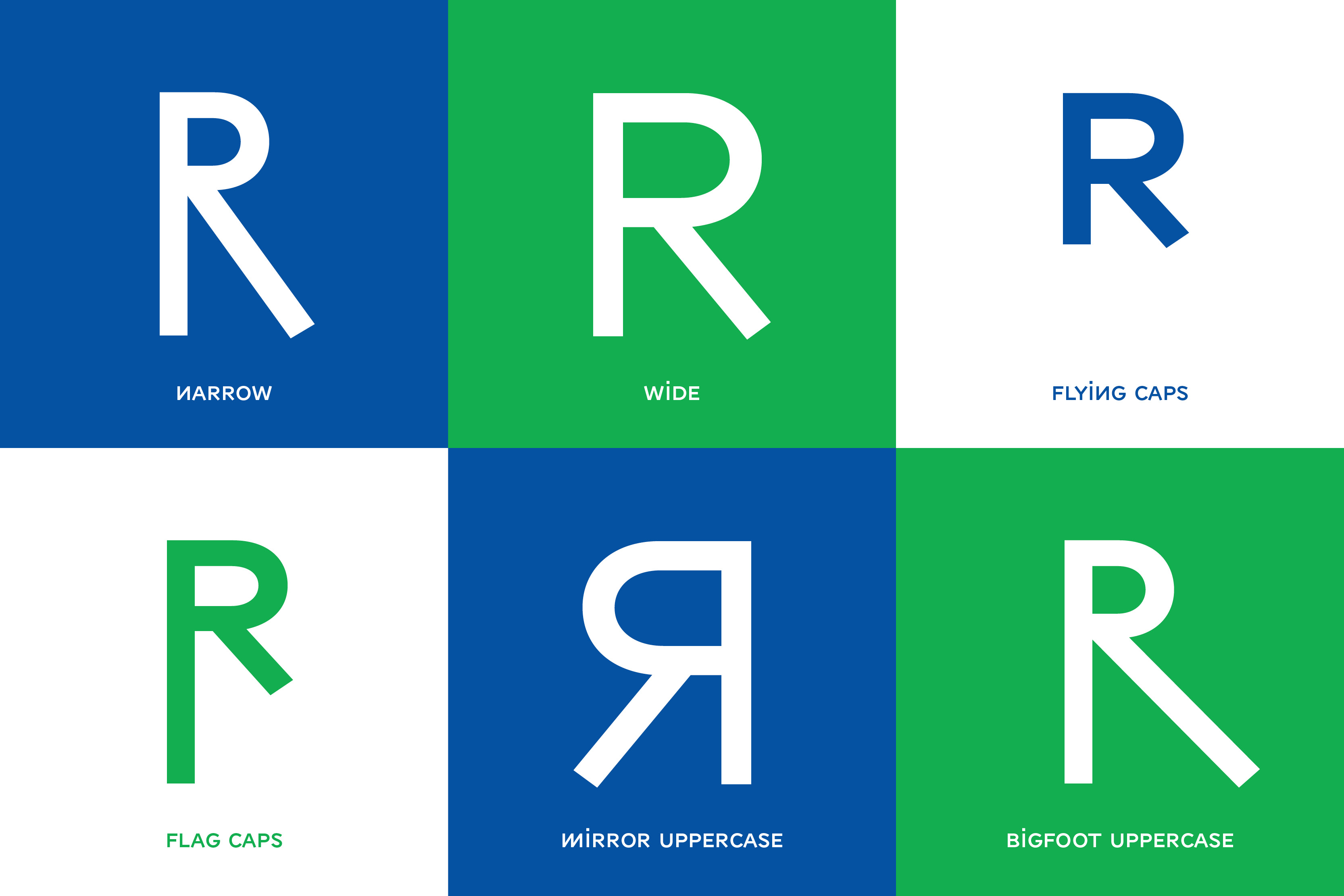
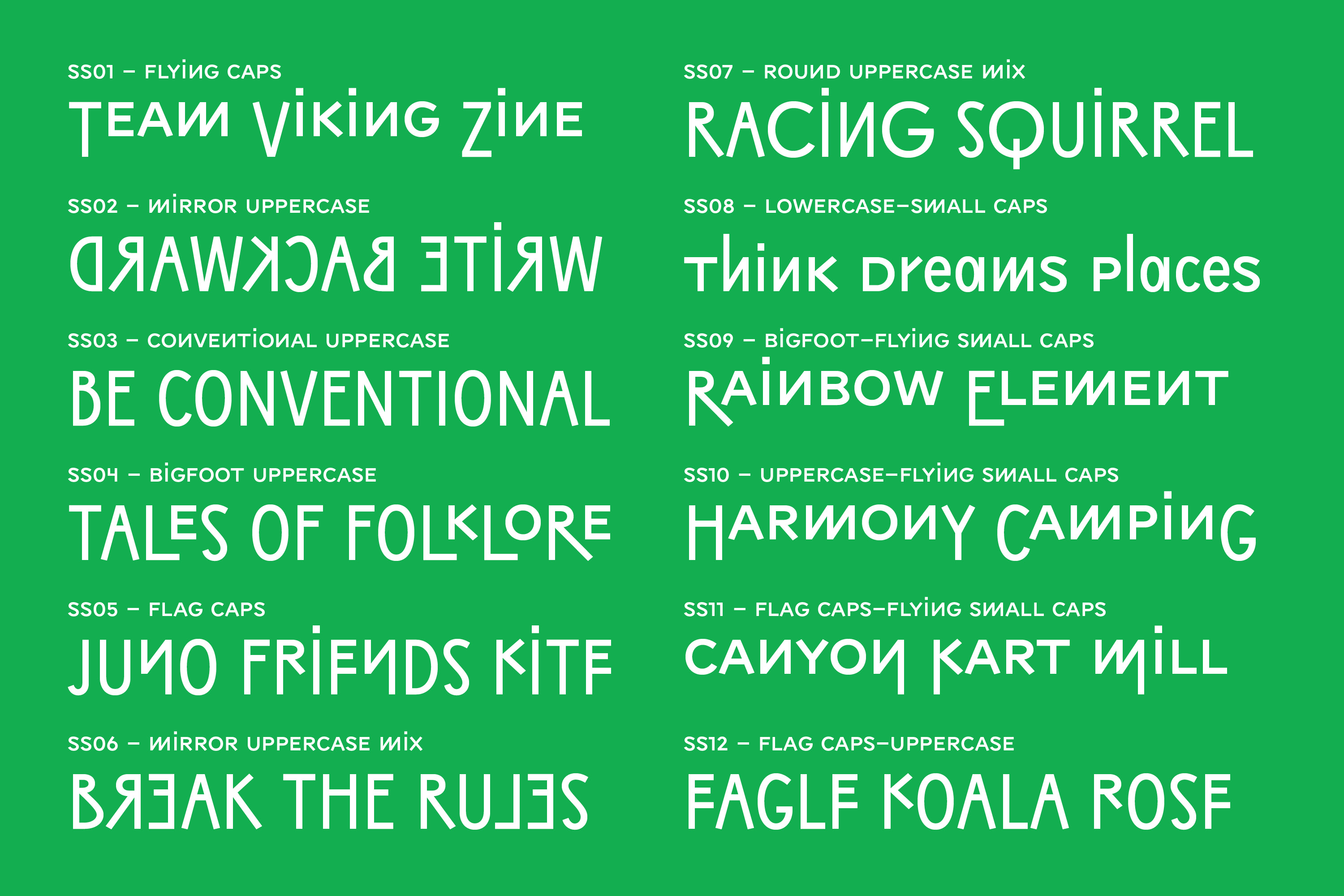
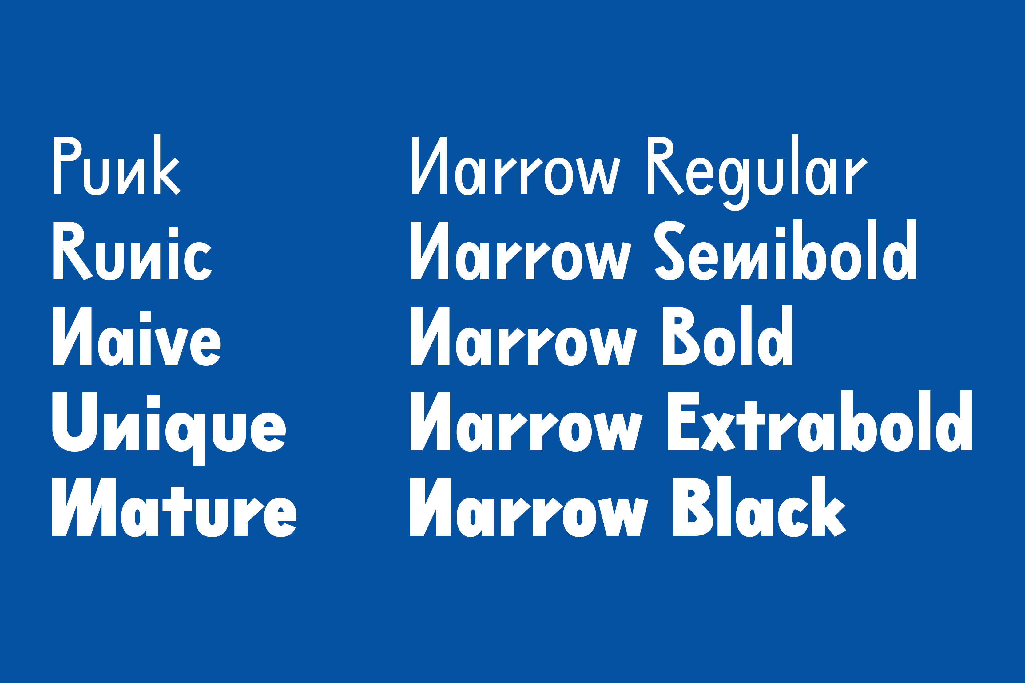
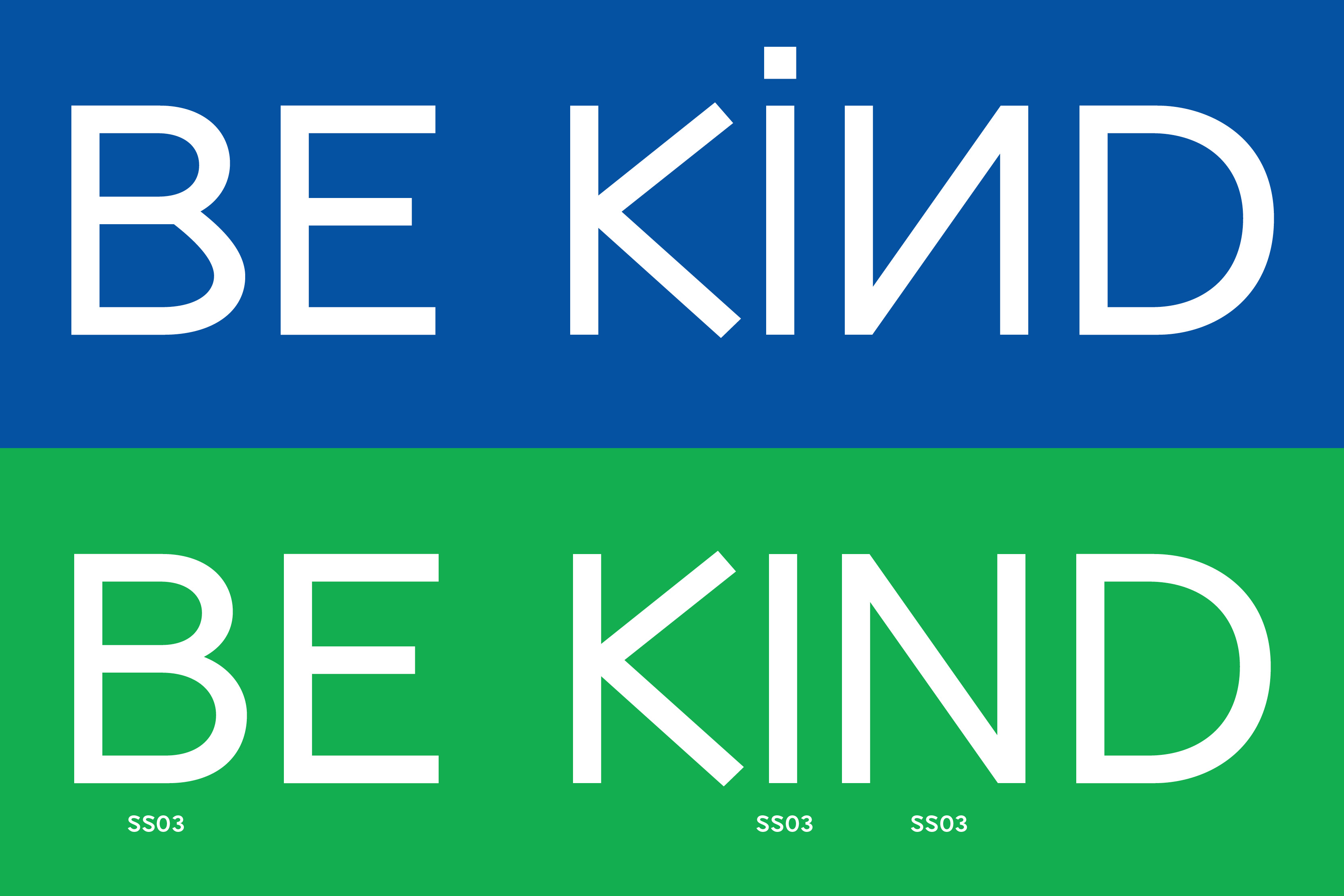
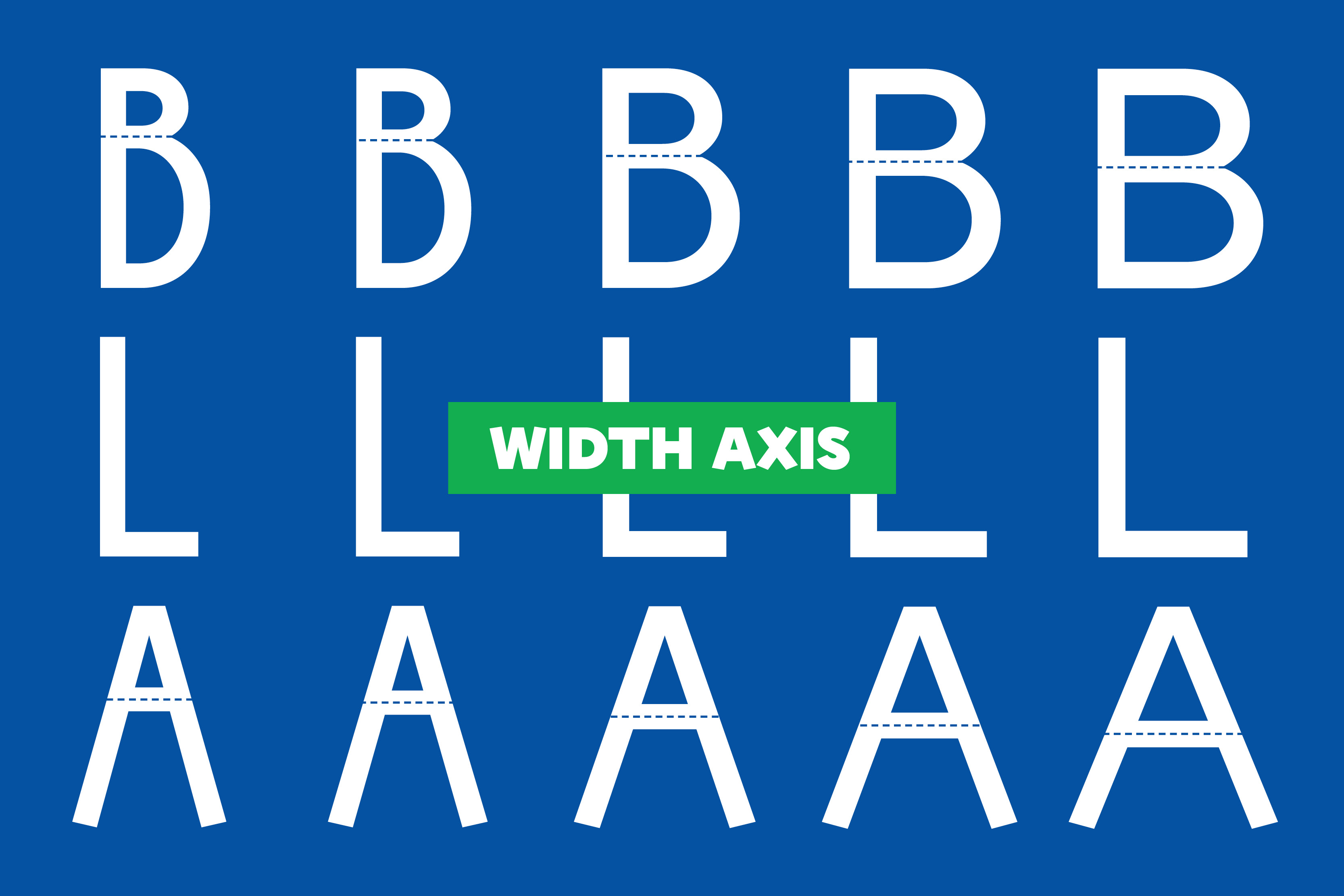
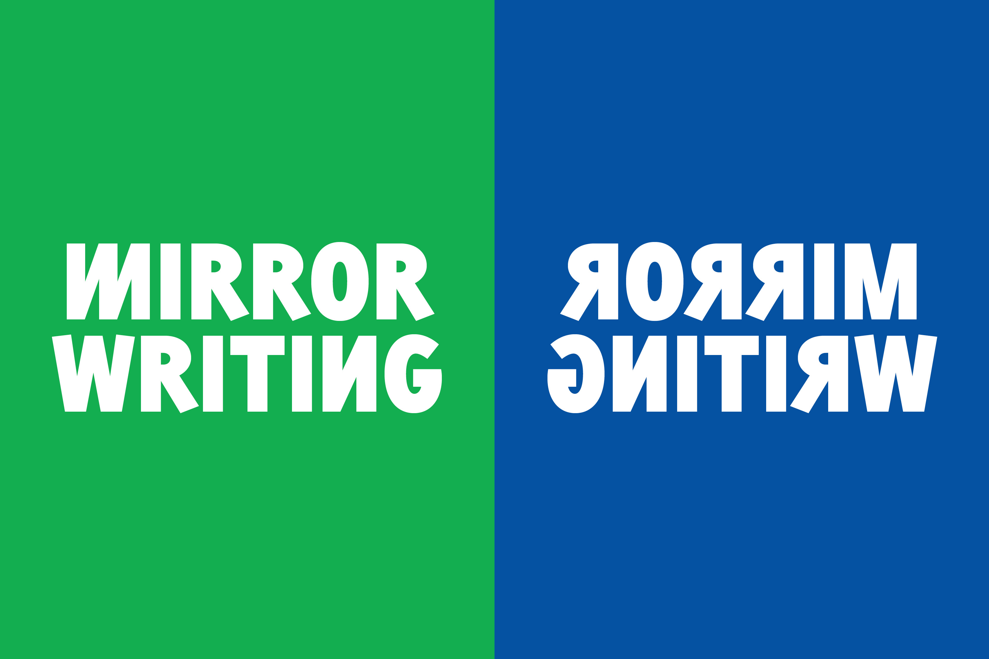
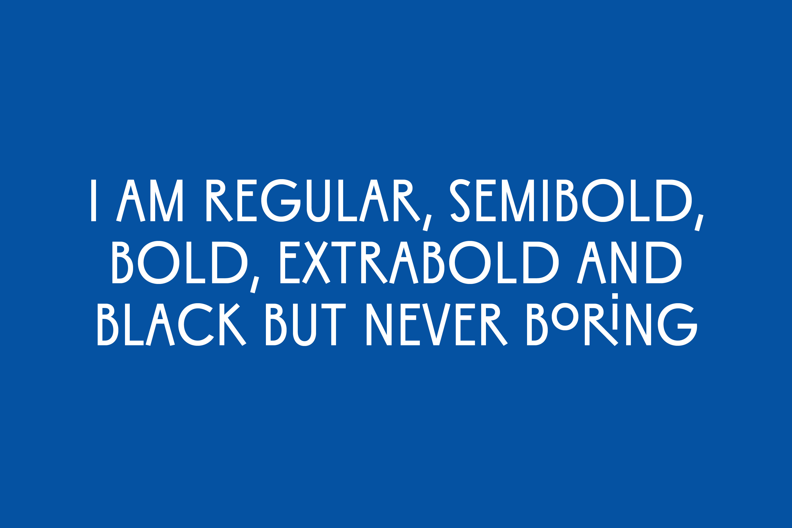
We have made these ideas into a variable font that changes features from Narrow to Wide, affecting not only the width but also the skeleton of the letters. Sixten includes conventional and expressive alternates that provide numerous ways of rebelling against the expected. Small Caps don’t follow conventional patterns, they use the same height as lowercase (petite caps) and their width is consistent across the width axis. The 12 stylistic sets include dynamic text combinations that mix mirror writing, flying small caps, flag caps and many more.
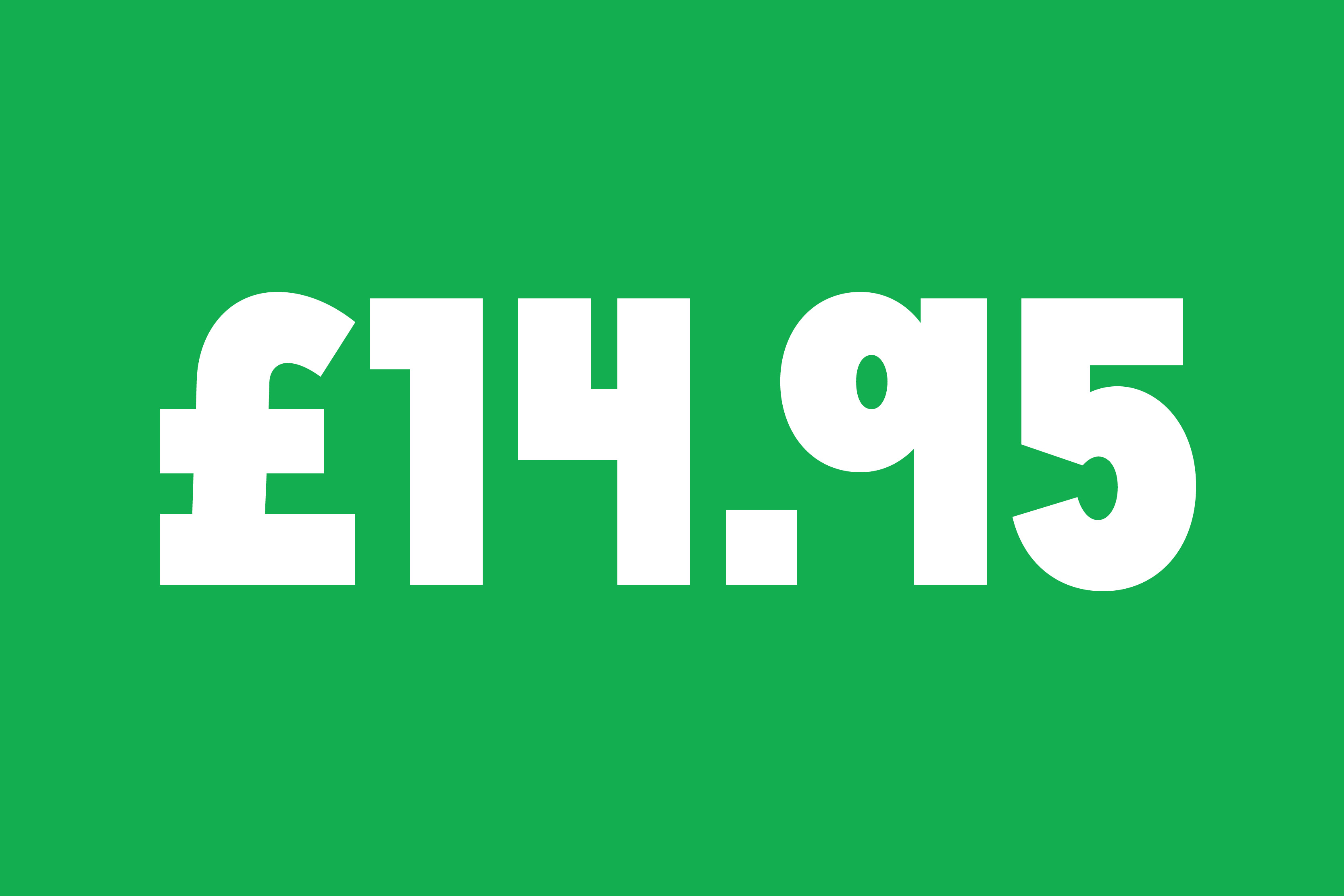
We have distilled ideas from a child’s early handwriting into typographic forms. There is a joyful and positive vibe to the design, it’s a little bit runic and a little bit punk. Sixten is a versatile typeface family that will bring a smile across faces with its unexpected shapes.
Get to know more about the design process in our article The evolution of lettershapes, children’s handwriting, and type
- Script
- Latin
- Release
- 2023
- Type design
- Noel Pretorius & María Ramos
- Specimen
- → Download PDF