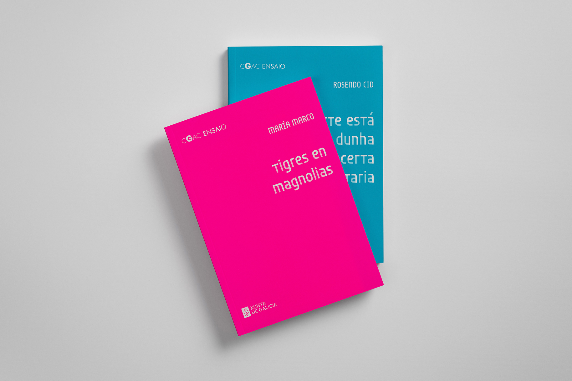
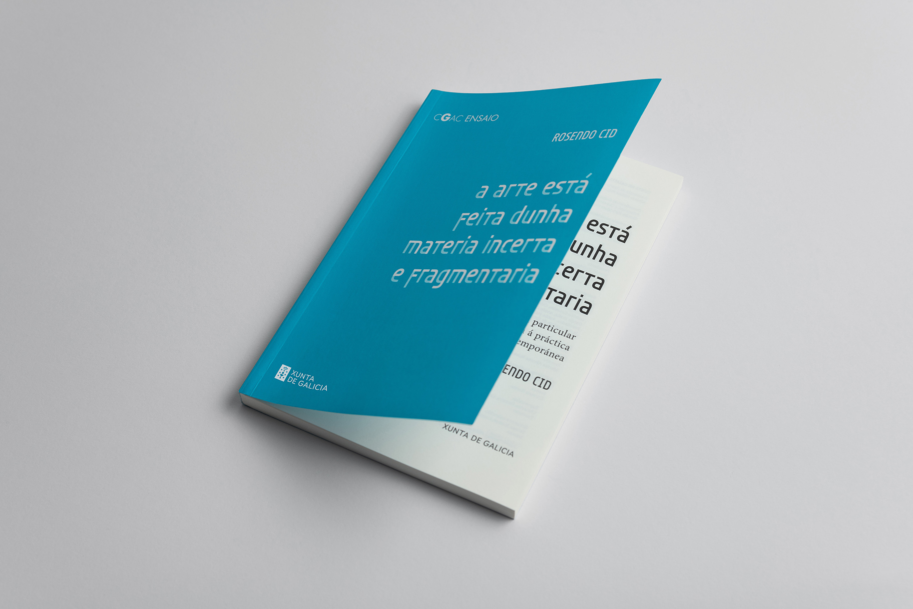
Every year, the Galician Centre of Contemporary Art make an open call for art essays written in Galician. ‘CGAC Ensaio’ is a book collection created to publish the winner’s text in different editions. Trisco CGAC is the custom display typeface we have designed for the covers.
The layered colour font is partly inspired by the ideas of Rosendo Cid, author of the first book in the collection, who describes art as something made of an uncertain and fragmented matter. The simple shapes of Joost Schmidt’s Bauhaus’ alphabet, the deconstructed letters in Bifur typeface by A. M. Cassandre, and the modular type forms created by Wim Crouwel, were some of the historical references considered for the design.
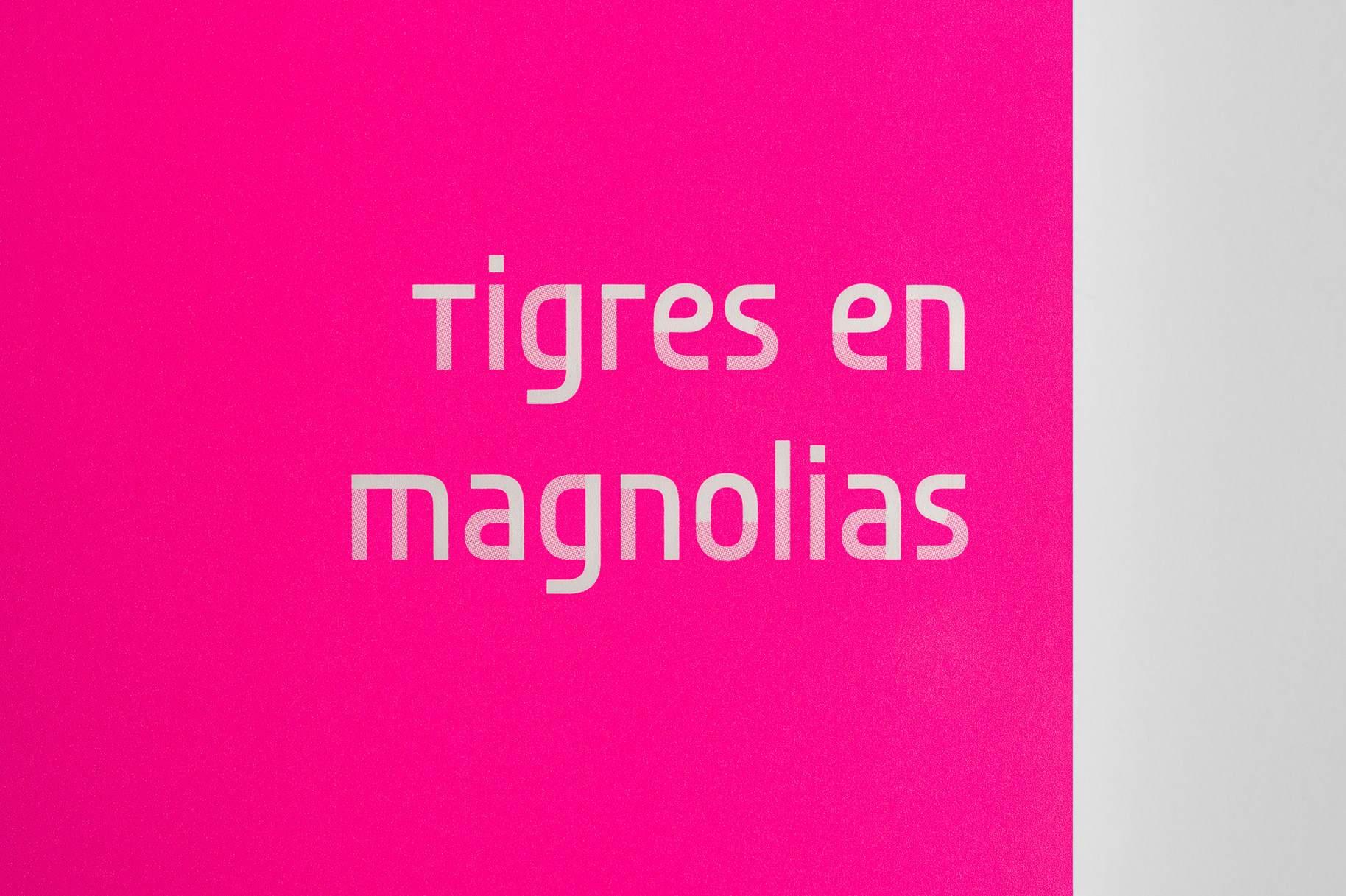
The apparently simple appearance of the typeface needs extra time and attention to fully understand how it was built. It is a set o constructed characters where colour sets the pace.
The structure of the letterforms includes large apertures, a simple skeleton and straight angles for the joins. Each character is divided into two parts (layers). When put together they build the complete lettershape, allowing for different colour combinations that can merge in the square-shape joins.
- Client
- CGAC
- Release
- 2021
- Type design
- María Ramos