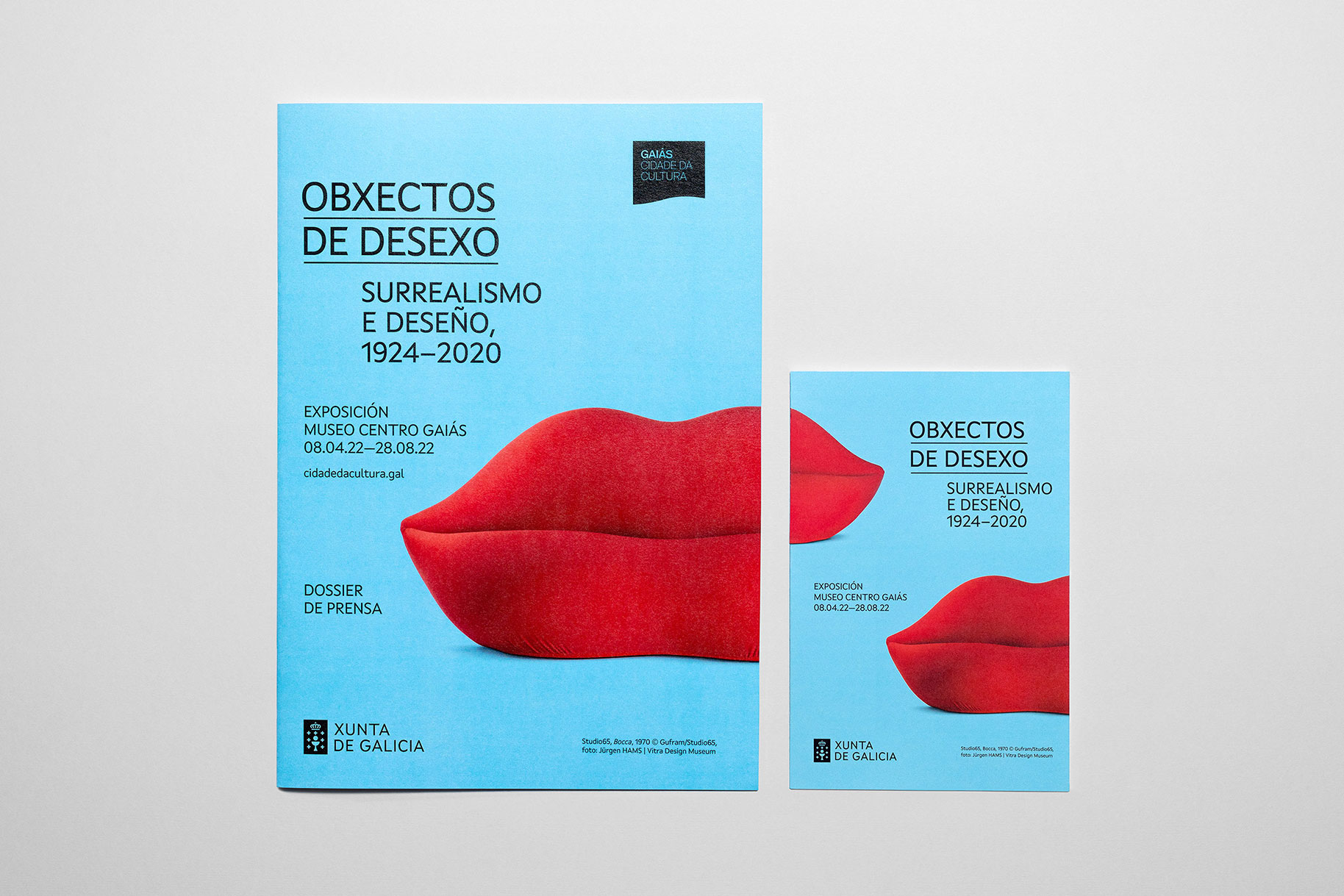
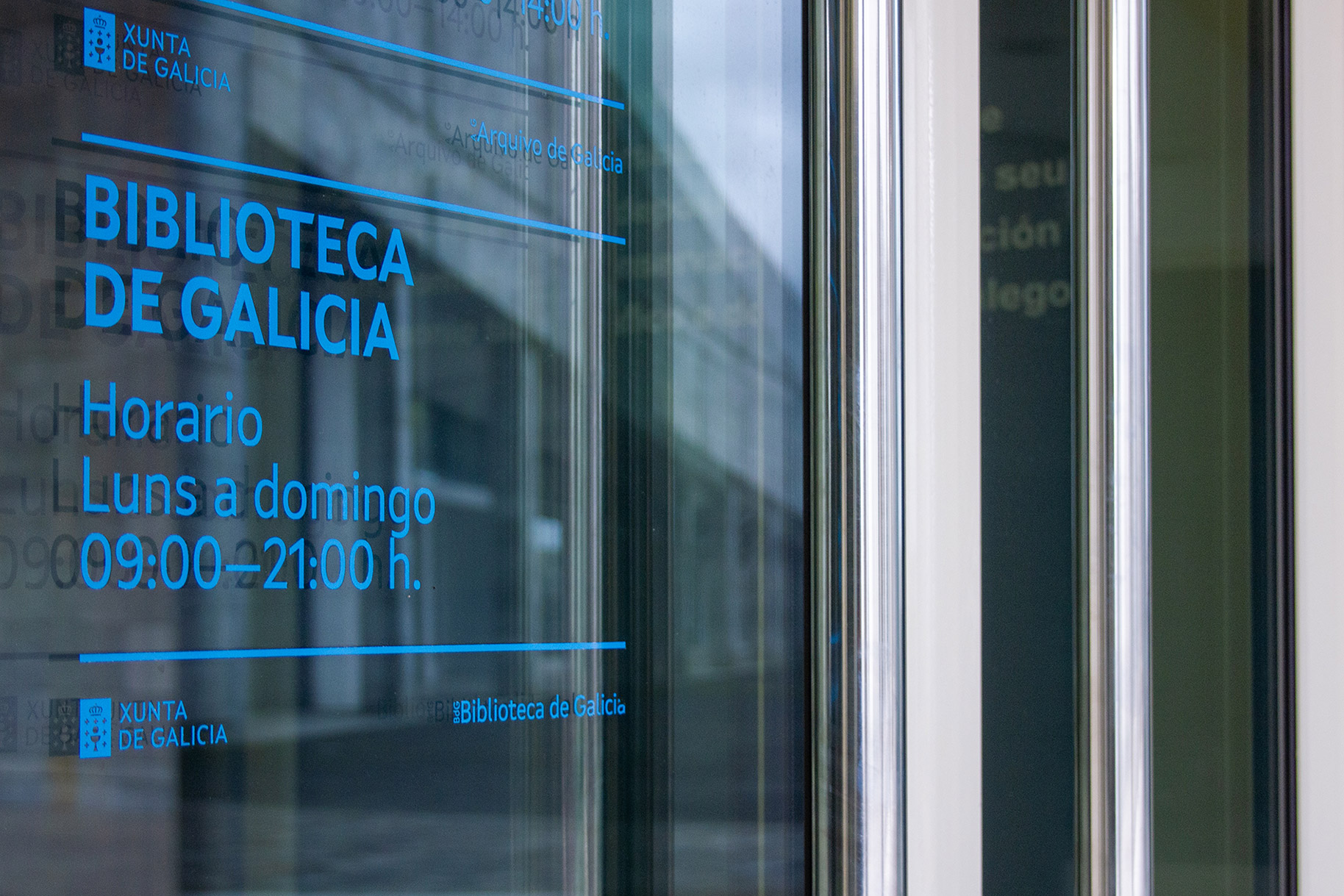
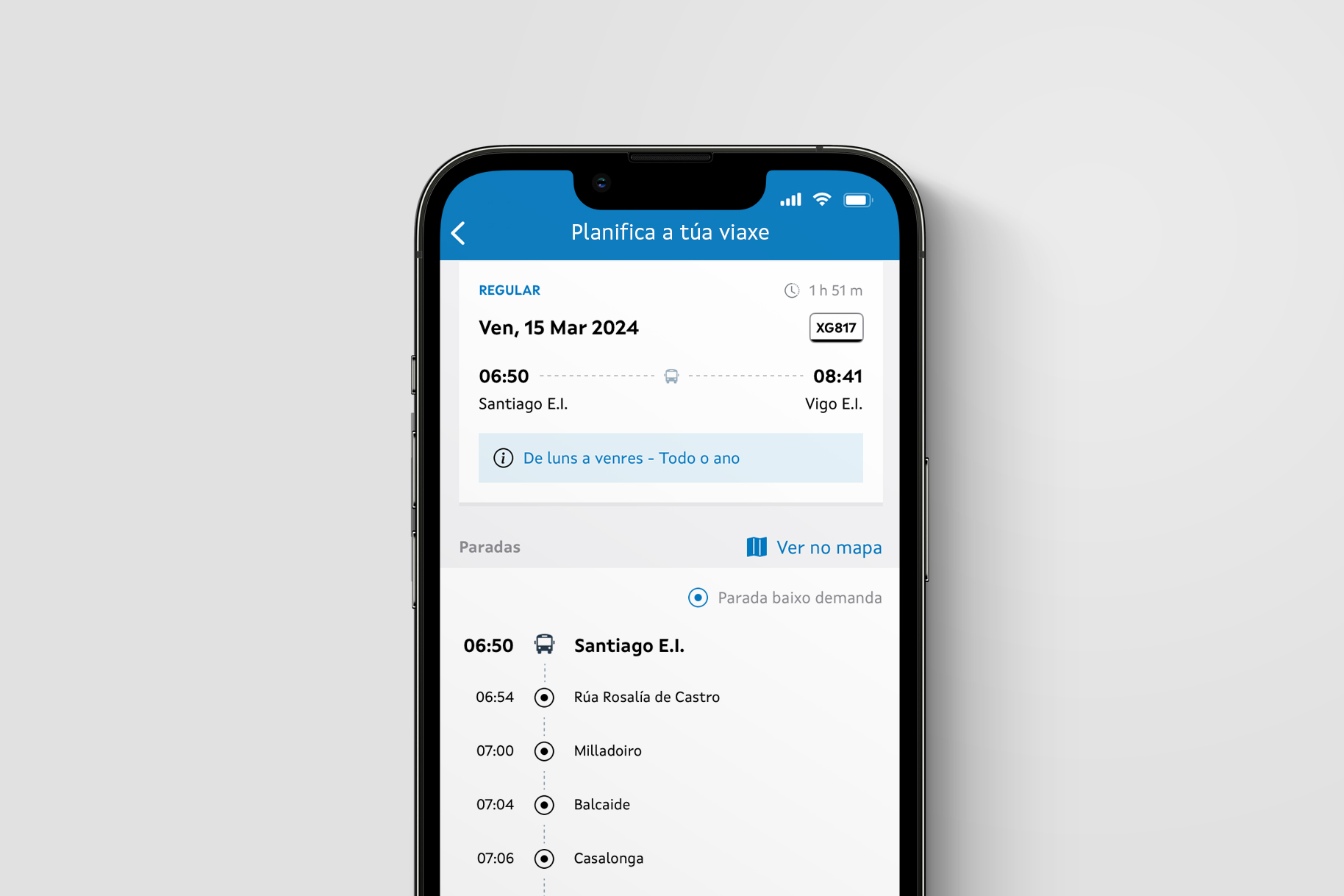
Xunta Sans is a specially tailored typeface family for the Galician Government and its related entities. The diversity and differences found in the communication of Xunta de Galicia needed an update to ensure that citizens could easily recognise the institution and their activities. The new typeface is used consistently throughout the organization’s identity, including on signage, websites, and printed materials.
During the design process, we carefully considered the diversity of formats and sizes. It was a challenging task, but we aimed to achieve clarity in the message and uniqueness in the identity.
Xunta Sans is a neohumanist typeface that is slightly condensed. The characters include diagonal cuts, tensioned curves, and sharp terminals. All these features are inspired by Galician symbols, such as the diagonal stripe in the flag, or the simplified emblem used in the logo.
The type family includes two weights with corresponding italic cuts. The italics take the slanted forms of the upright, exaggerating the characters’ inclination, enhancing expressivity and differentiation.
Regular and Bold also have a monospaced version, making the type family more versatile and fulfilling particular technical needs.
- Client
- Xunta de Galicia
- Design agency
- Costa
- Release
- 2021–2022
- Type design
- María Ramos & Noel Pretorius
- Monospace design
- María Ramos