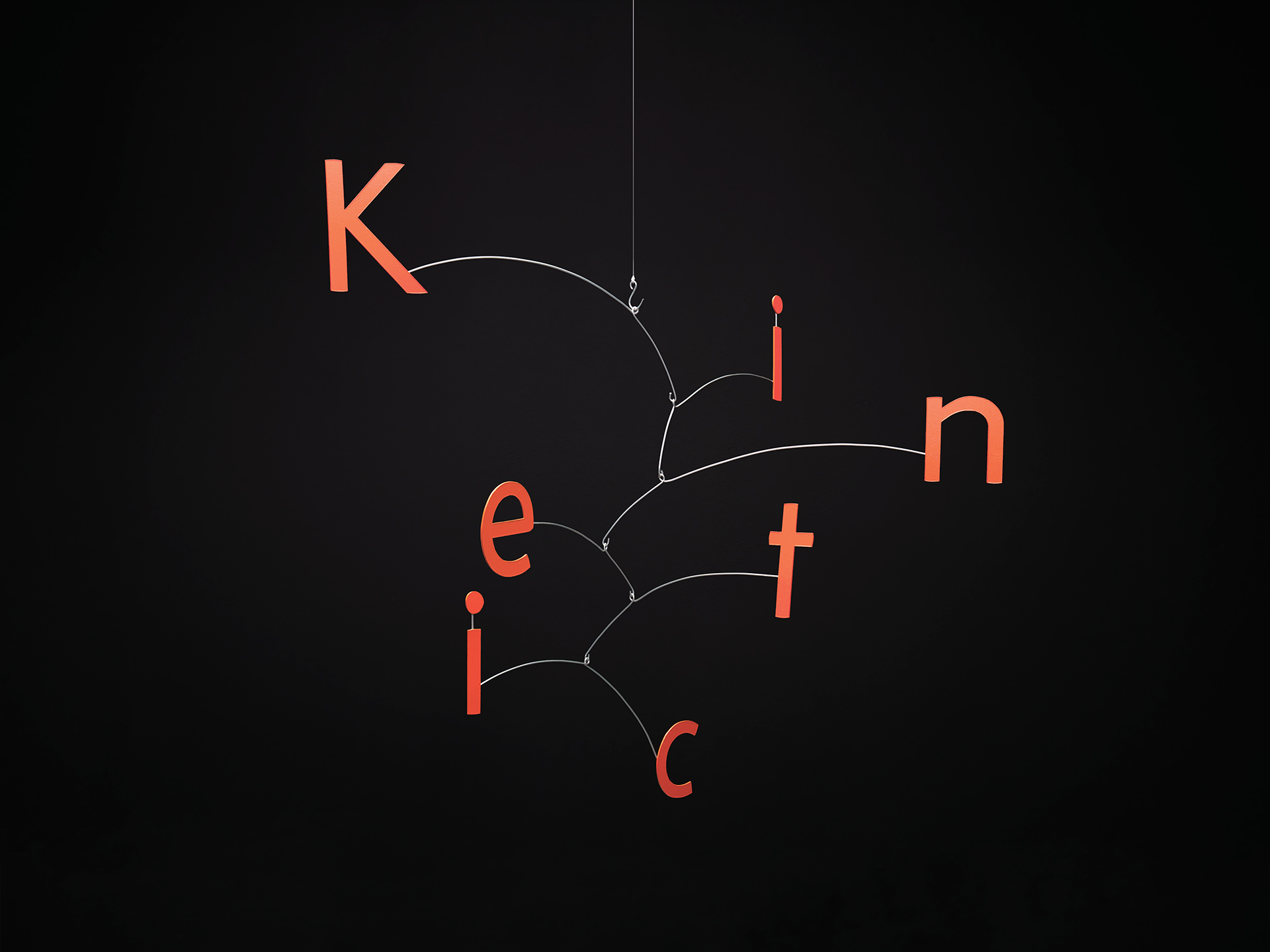
One of the main sources of inspiration for the design was the art of Alexander Calder. He started working with moving sculptures in Paris at the beginning of the 1930’s. The light, playful and soft appearance of Calder’s mobiles was something the designers wanted to translate into type forms.
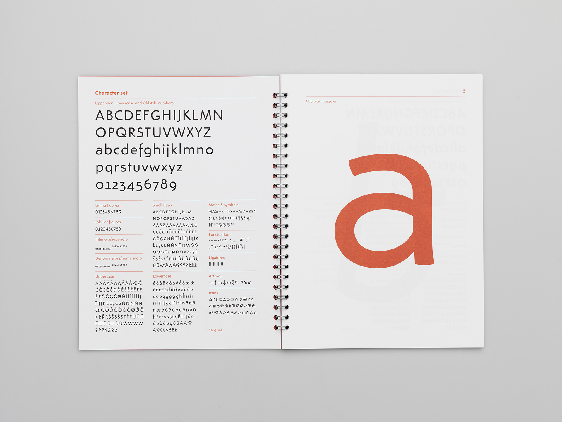
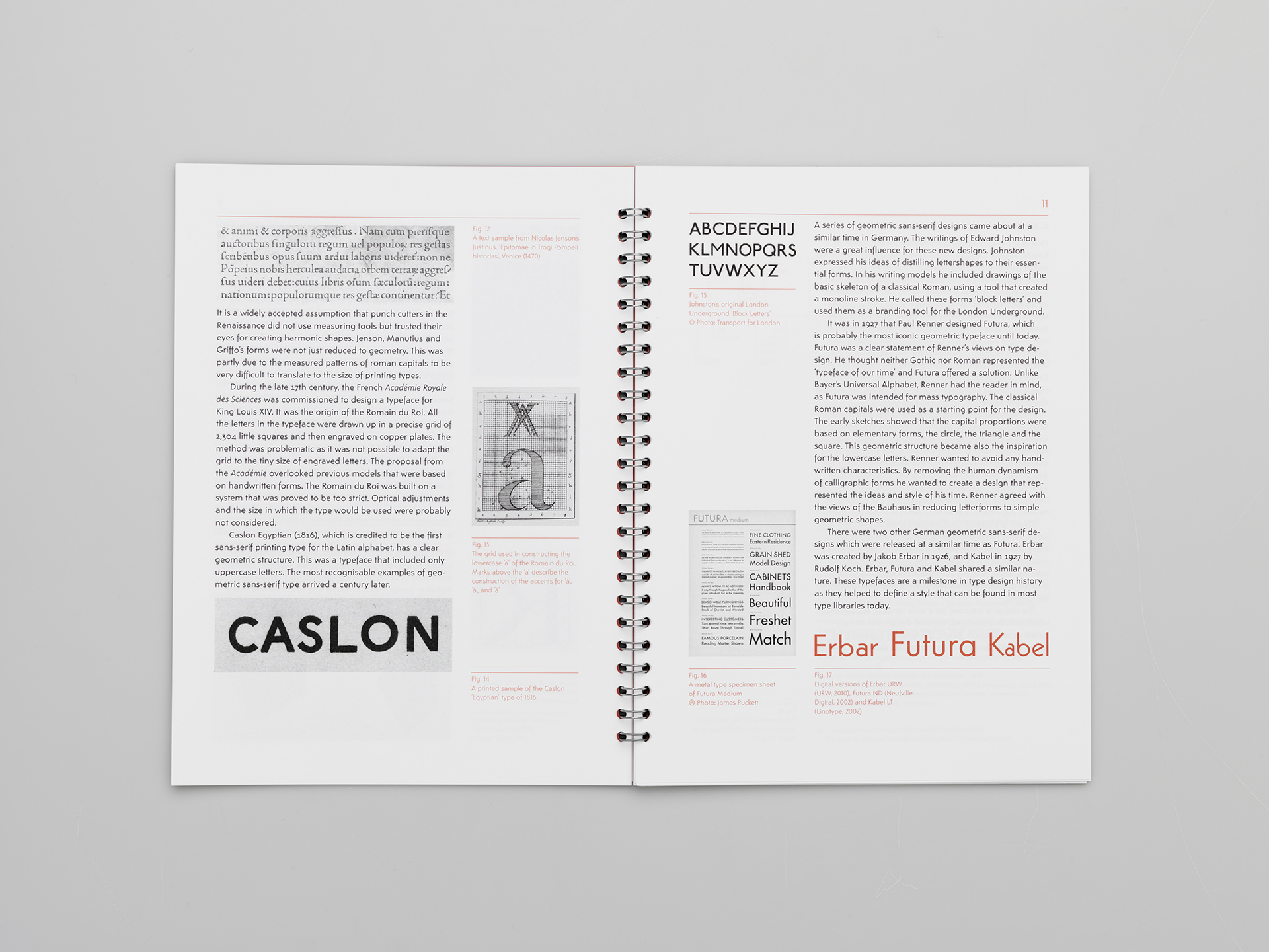
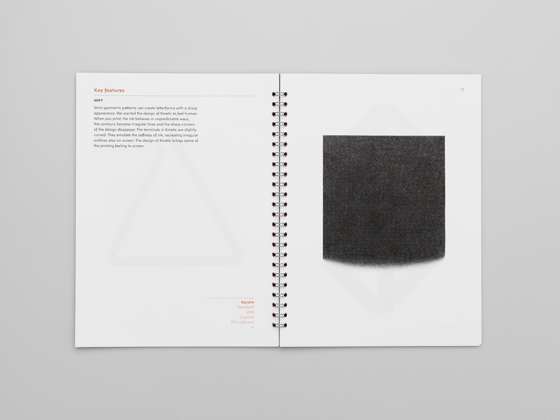
Kinetic is a geometric sans-serif that avoids strict design patterns. Although geometry is clearly present in the simple structure of the characters, optical corrections have been included and there is room for interpretation in the design of each particular character.
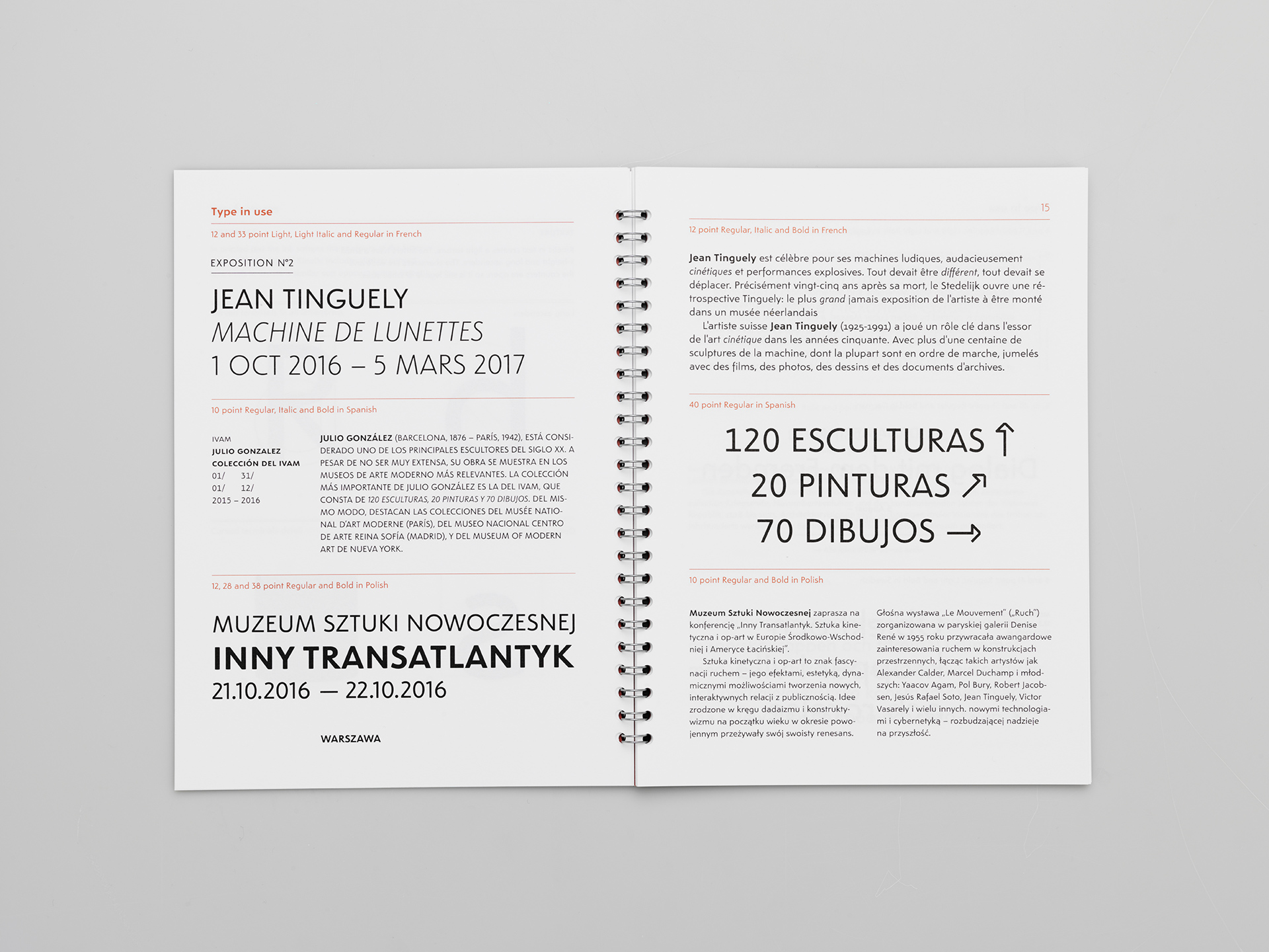
Kinetic is a crafted design that comes in 3 weights with italics. It is a text typeface that was created with the reader in mind. Kinetic is a functional and modern typeface that feels comfortable to read.
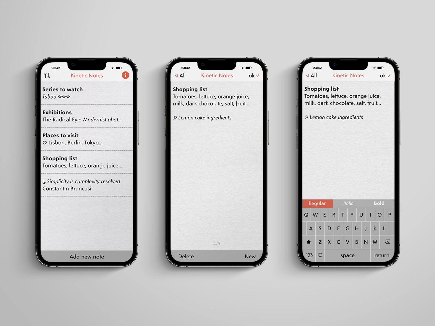
Kinetic is a typeface family appealing for contemporary typographic use, both on print and screen. The design is intended for a wide range of applications which include advertising, editorial design, and any corporate or art project.
- Script
- Latin
- Release
- 2017
- Type design
- Noel Pretorius & María Ramos
- Specimen
- → Download PDF
